Kirby Nelson Orthodontics: Smiles through Heart and Innovation
Struggling to bring your brand’s personality to life? Wondering how to connect with your audience in a way that feels real—not forced? You’re not alone. We know you want a brand that doesn’t just look good but feels authentic, cohesive, and impactful at every touchpoint. That’s exactly what we delivered for Kirby Nelson Orthodontics: a brand that smiles back, engages their audience, and deepens community connections—online, offline, and everywhere in between. If you’re ready to see how a thoughtful brand strategy can make your business unforgettable, read on.
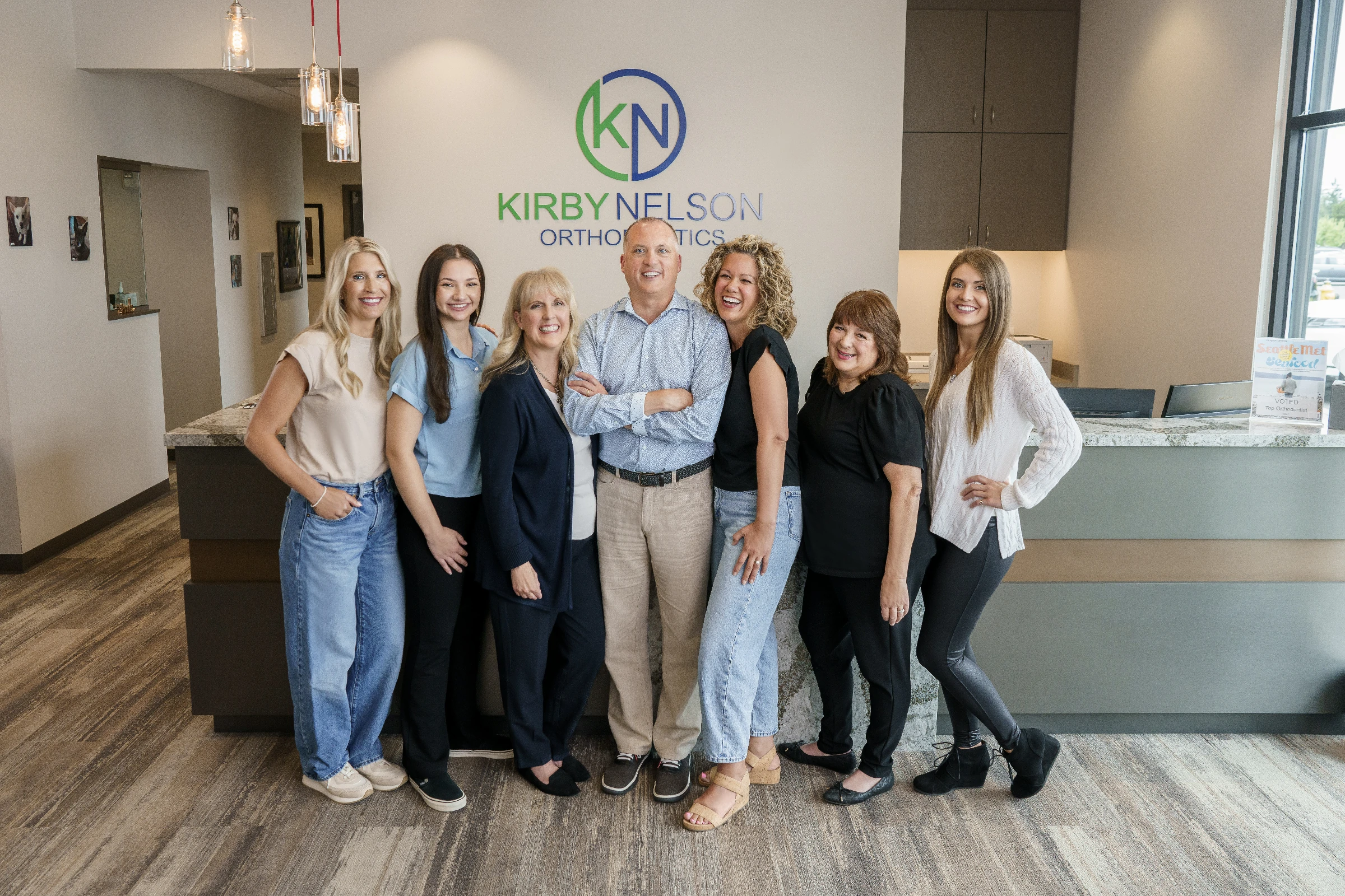
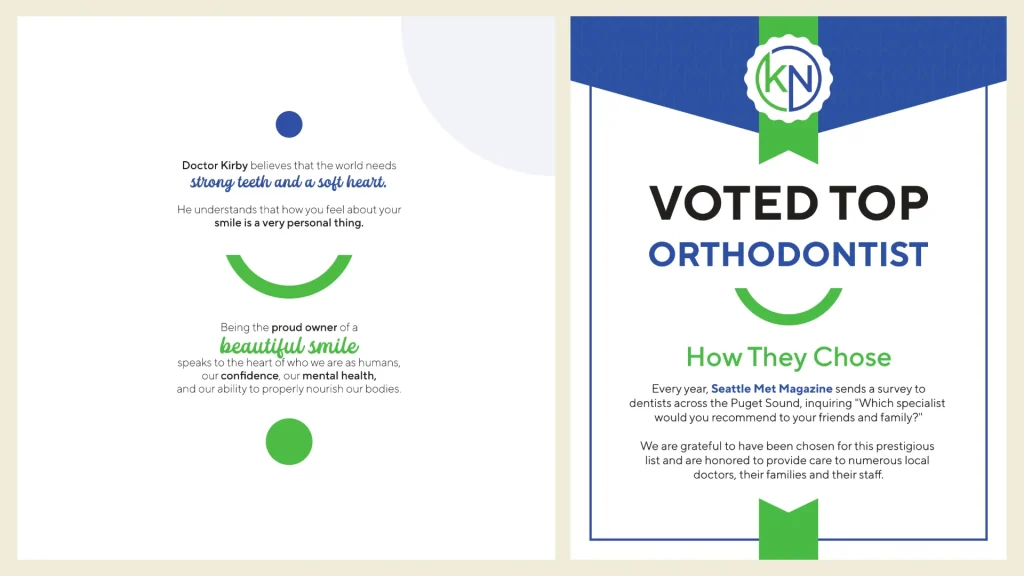
The Journey Begins When Kirby Nelson Orthodontics approached us, they brought decades of expertise and a strong reputation in Maple Valley and Enumclaw. Their logo, with its bold use of the letters “K,” “N,” and “O,” was well-loved but ripe for refinement. They wanted a brand that reflects their expert care, vibrant personality, and the joy they bring to their patients. This wasn’t just about visuals—it was about telling the full story of a practice rooted in community, care and FUN!
Designing a Brand That Smiles Back
Bringing the Brand to Life Kirby Nelson Orthodontics is all about making people smile, and we brought their vibrant personality to life through a cohesive and thoughtfully crafted brand identity.
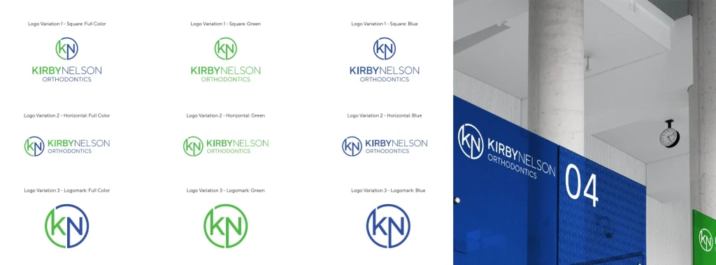
Logo
Building on their existing logo, we created variations to ensure versatility across multiple applications:
Square Format: Perfect for social media and profile icons.
Horizontal Layout: Ideal for website headers and office signage.
Logomark: Simplified for compact branding, like mobile icons.
These options gave Kirby Nelson Orthodontics flexibility to present their brand consistently, no matter the platform.
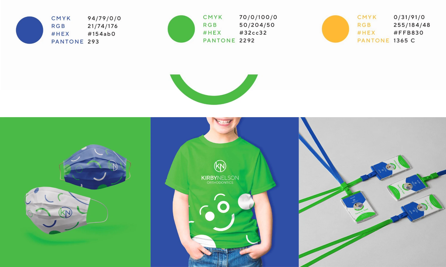
Color Palette
We honored their established blue and green tones, rich with meaning:
Blue: Calm, secure, reliable—reflecting the trust patients place in Kirby Nelson Orthodontics.
Green: Growth, renewal, balance—a nod to the transformative journey of orthodontic care.
Secondary Color
To infuse energy and optimism into the Kirby Nelson Orthodontics brand, we introduced yellow as a secondary color. Beyond its cheerful representation of joy, happiness, and intellect, yellow plays a strategic role in creating contrast and guiding attention.
We intentionally used yellow to:
Highlight Key Focal Points: Whether it’s a call-to-action button, an announcement about a contest, or a special promotion, yellow ensures these elements stand out and capture attention.
Add Contrast: Against Kirby Nelson Orthodontics’s calming blue and green tones, yellow serves as a dynamic pop that breaks up designs and draws the eye exactly where it’s needed.
Celebrate Moments: From holiday campaigns to milestone celebrations, yellow adds a layer of excitement and energy that aligns with Kirby Nelson Orthodontics’s positive and approachable personality.
This thoughtful integration of yellow not only brightens the brand visuals but also enhances functionality—making sure Kirby Nelson Orthodontics’s messaging is as engaging as it is effective.
Typography
To complement their professional and approachable tone, we thoughtfully selected a youthful and spirited script font to highlight key words and phrases. This hand-written, readable style strikes a balance—capturing a playful, energetic vibe without leaning too feminine, like traditional cursive, or too masculine. The font was carefully chosen to reflect Kirby Nelson Orthodontics’s lighthearted personality while maintaining clarity and legibility, ensuring it enhances the brand visuals without compromising their accessibility. This choice brings a fresh, engaging tone to the brand, making orthodontics feel approachable and enjoyable for all ages.
Brand Elements
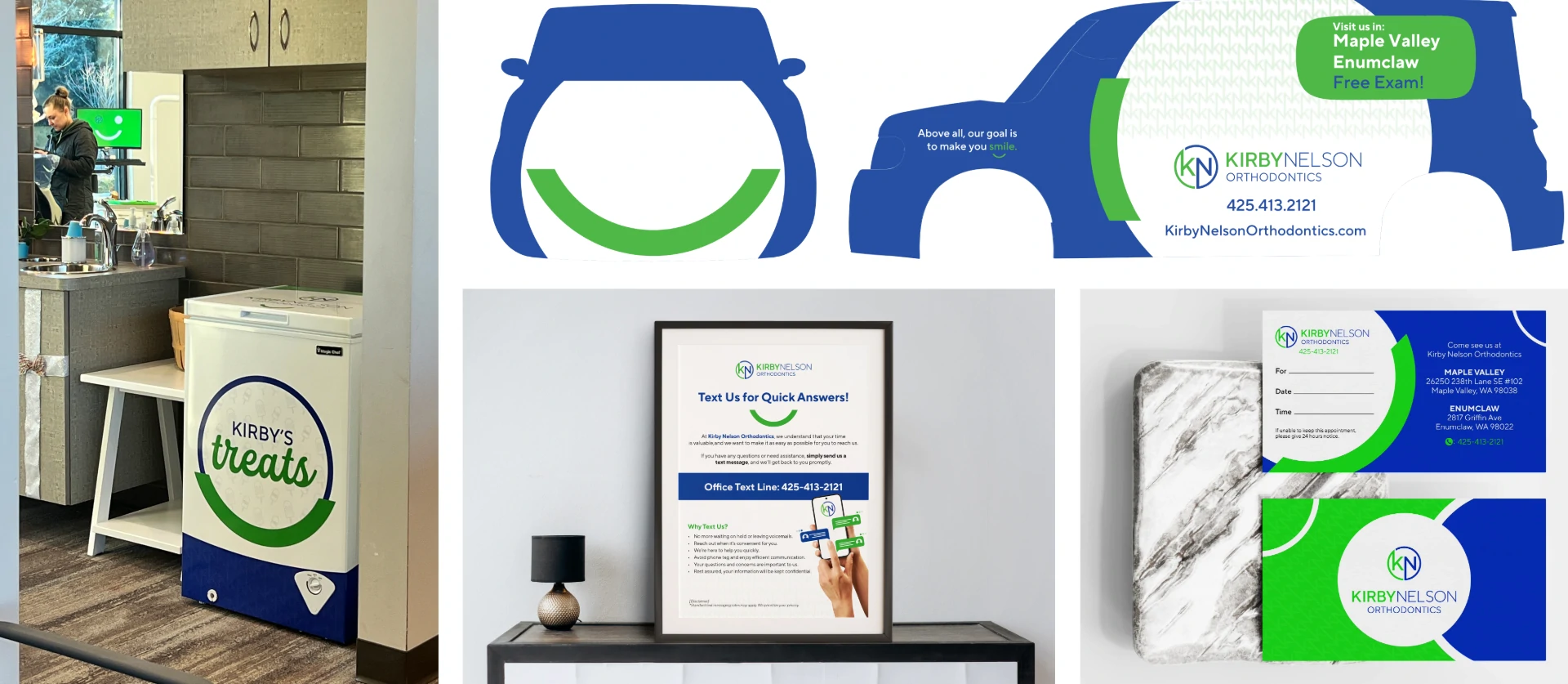
One of the key elements we introduced was a custom smile-shaped design element that emulates Kirby Nelson Orthodontics’s fun personality and their mission to spread joy throughout their community.
This smile design element was intentionally integrated across every touchpoint to create a consistent, engaging experience:
Branded Materials & Spaces: From vehicle wraps and desktop wallpapers to business cards and freezer wraps, the smile element ensures the Kirby Nelson Orthodontics brand shows up everywhere patients interact with them.
Social Media: The smile element adds a playful, personable touch to their content, showcasing the vibrant personality that makes Kirby Nelson Orthodontics stand out.
By weaving this smile element into their brand visuals, we brought their mission to life—spreading smiles and joy both online and offline. It’s a small but powerful detail that reflects who they are and how they care for their patients.
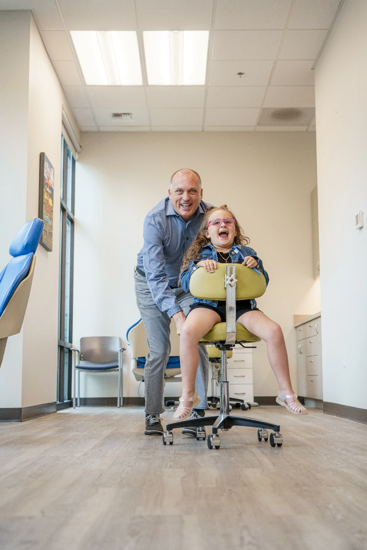
Authentic Photography that Builds Real Connections
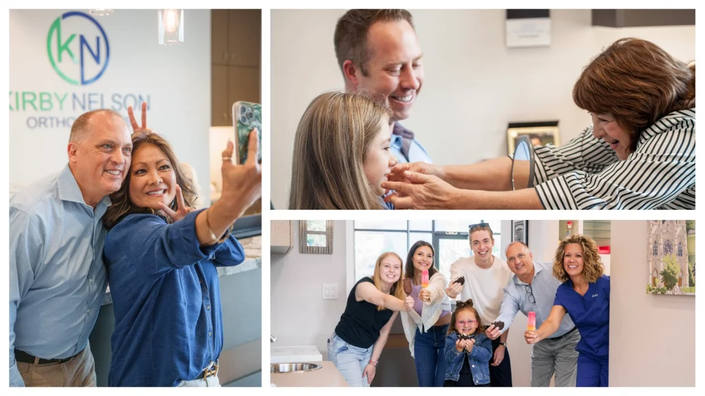
Stepping away from generic stock imagery, we focused on Brand Photography that felt authentic, vibrant, and real. We encouraged the Kirby Nelson Orthodontics team to show up in their photography, highlighting their personalities, their care for patients, and the warmth of their practice.
While stock photography has its time and place, real people create real connections. By showcasing the Kirby team and community members as models, we gave patients an honest glimpse into what they can expect—genuine smiles, friendly faces, and a welcoming atmosphere.
As their ‘branding mama bear’ as we often joke, we took the lead on photography and production, ensuring every shot reflected the heart and energy of Kirby Nelson Orthodontics. The result? A visual story that builds trust, deepens connection, and sets Kirby Nelson Orthodontics apart as a practice where people—not just smiles—come first.
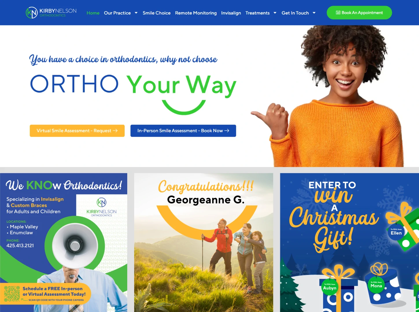
Social Media: Bringing their Brand to Life
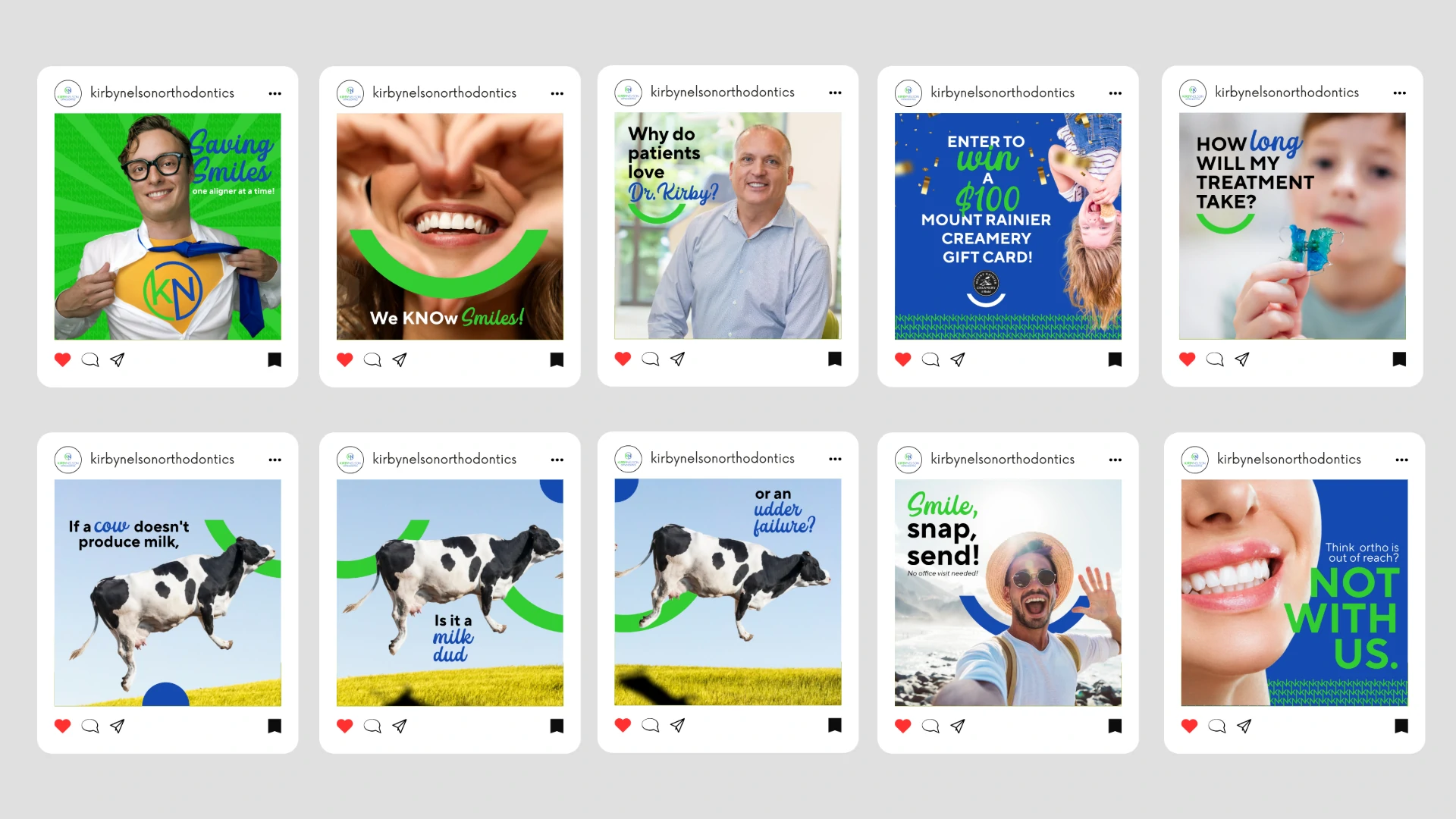
Social media has become a powerful platform for Kirby Nelson Orthodontics to showcase their vibrant personality and build lasting connections. We’ve transformed their online presence into an engaging space where ortho is approachable and even fun. Through our efforts, we:
Entertained: Infused humor and playfulness into posts, making the Kirby Nelson Orthodontics experience relatable and enjoyable for patients of all ages.
Educated: Delivered valuable insights about orthodontic care, treatments, and technology, empowering their audience with knowledge.
Engaged: Highlighted the people behind the smiles, celebrating patient milestones and community involvement to foster a sense of belonging.
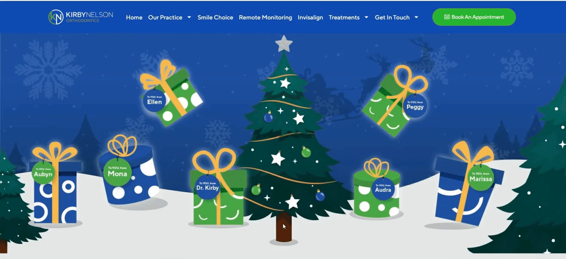
Gamification Marketing: Creativity That Connects
Marketing can be FUN, and this brand brings it! We elevated Kirby Nelson Orthodontics’s engagement and lead generation efforts through Gamification Marketing, blending social media and website traffic into dynamic, interactive campaigns. These efforts seamlessly integrated their brand’s playful tone and community-focused approach, creating memorable experiences while increasing Kirby’s leads and community connection.
Through these campaigns, we:
Introduced New Leads: Brought fresh prospects into the marketing pipeline through innovative and engaging strategies that encouraged participation and interest.
Sparked Engagement: Designed fun and interactive contests that encouraged community participation and excitement.
Drove Traffic: Linked engaging social content to their website, increasing awareness and generating leads.
Built Deeper Connections: Fostered relationships with participants through creative and consistent branding, reinforcing Kirby Nelson Orthodontics’s role as a trusted community partner.
These creative initiatives didn’t just entertain—they deepened Kirby Nelson Orthodontics’s connection with their community, demonstrating their modern approach and commitment to making orthodontics accessible, enjoyable and FUN!
Ready to Make an Impact?
Your brand deserves to connect, inspire, and thrive—just like we’ve done for Kirby Nelson Orthodontics. If you’re ready to transform your brand into something unforgettable, it’s time to take the next step.
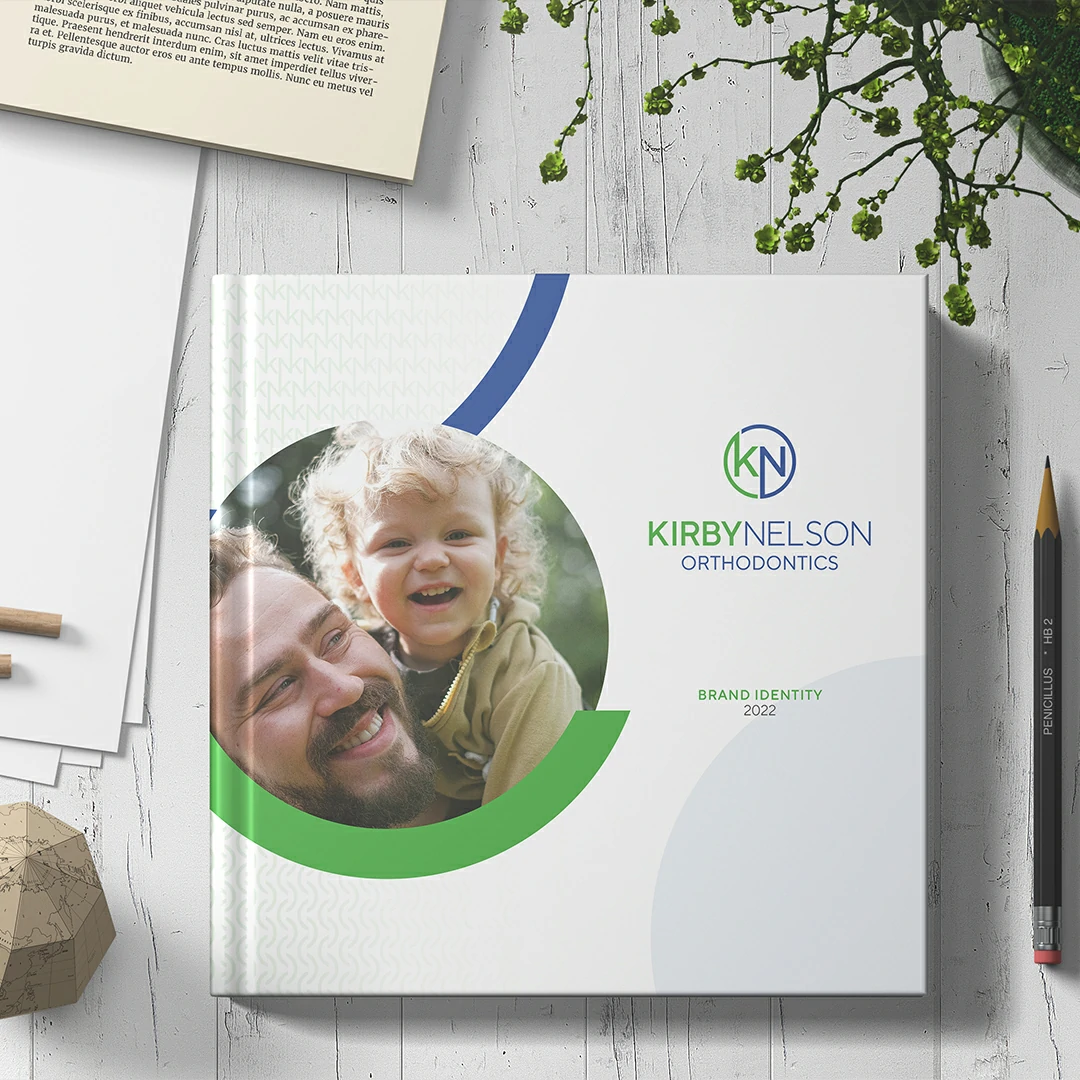
Our brands aren’t just delivered—they’re presented. Every brand we create is captured in a beautifully crafted 12×12 hardback physical book. This isn’t just a design portfolio; it’s a guide to your brand’s identity, mission, and story, meant to inspire and ensure consistency at every touchpoint.
Explore the complete Kirby Nelson Orthodontics Brand Book and see how every element—from the logo variations to the smile-shaped design element—works together to bring their vibrant personality to life.