We started with their story.
As we listened, we discovered that every detail carried meaning. Russ’s favorite color was yellow. Spencer’s name began with an “S,” just like Safety. Protection was at the heart of everything Youngstrom Safety stood for.
Those stories became the foundation of the brand.
The shield wasn’t simply a design element—it represented protection. The flowing “S” honored both Safety and Spencer. The vibrant yellow wasn’t chosen because it looked beautiful; it celebrated Russ while reinforcing the optimism, awareness, and hope that define Youngstrom Safety’s mission.
Every design decision had purpose because every element represented the people behind the story.
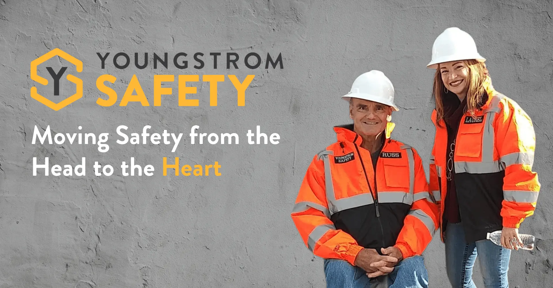
Youngstrom Safety’s mission has always been about protecting people. We transformed that mission into a brand identity rooted in family, purpose, and the belief that every design decision should reflect the heart behind the work.
Every great logo tells a story. The Youngstrom Safety logo tells a life story.
Rather than creating a symbol that simply looked like a safety company, we designed an identity rooted in the people and purpose behind the mission. Every line, shape, and color was intentionally crafted to represent what Youngstrom Safety stands for: protecting lives by moving safety from the head to the heart.
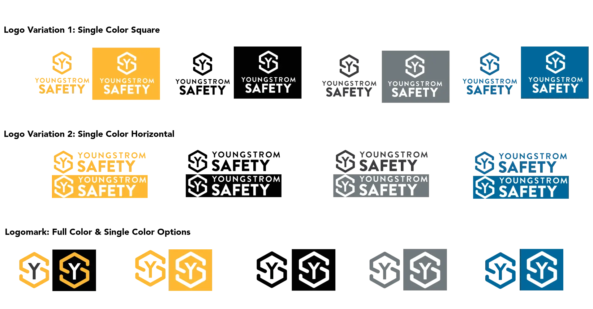
Primary Logo: Designed for presentations, proposals, and branded materials where the full Youngstrom Safety identity takes center stage.
Horizontal Logo: Optimized for websites, presentation templates, banners, and signage where a wider layout creates greater flexibility.
Logomark: A simplified mark featuring the shield and “YS” monogram, ideal for social media, merchandise, icons, and applications where space is limited.
At the heart of every variation is the shield—a symbol of protection—and the custom “S,” representing both Safety and Spencer, reminding every audience that someone is waiting at home. Together, these elements transform the logo from a visual identifier into a daily reminder of why every decision matters. This design approach aligns with the brand’s purpose of moving safety from knowledge to personal responsibility.
These logo variations ensure Youngstrom Safety can present a consistent brand across every touchpoint while never losing sight of the mission behind it.
Each color in the Youngstrom Safety Brand was chosen with intention. Each one reflects part of our story and reinforces our mission of Moving Safety from the Head to the Heart.
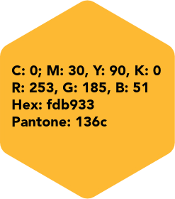
Spence Yellow is the heart of the Youngstrom Safety brand. Inspired by caution signage, it captures attention while representing honor, loyalty, joy, and optimism.
More than a bold visual element, it serves as a reminder to pause, think, and make every decision count.
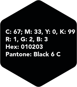
Black adds strength and contrast to the Youngstrom Safety brand. It represents confidence, integrity, and the seriousness behind every safety message.
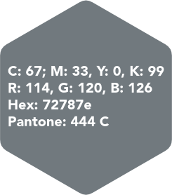
Deep Steel grounds the Youngstrom Safety brand. Inspired by the realities of the workplace, it represents strength, resilience, and the hardworking environments where safety matters most.
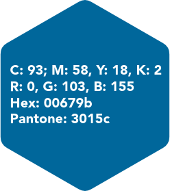
Industrial Blue provides balance to the Youngstrom Safety brand. It represents trust, confidence, and stability while reinforcing the strength, resilience, and integrity behind the mission.
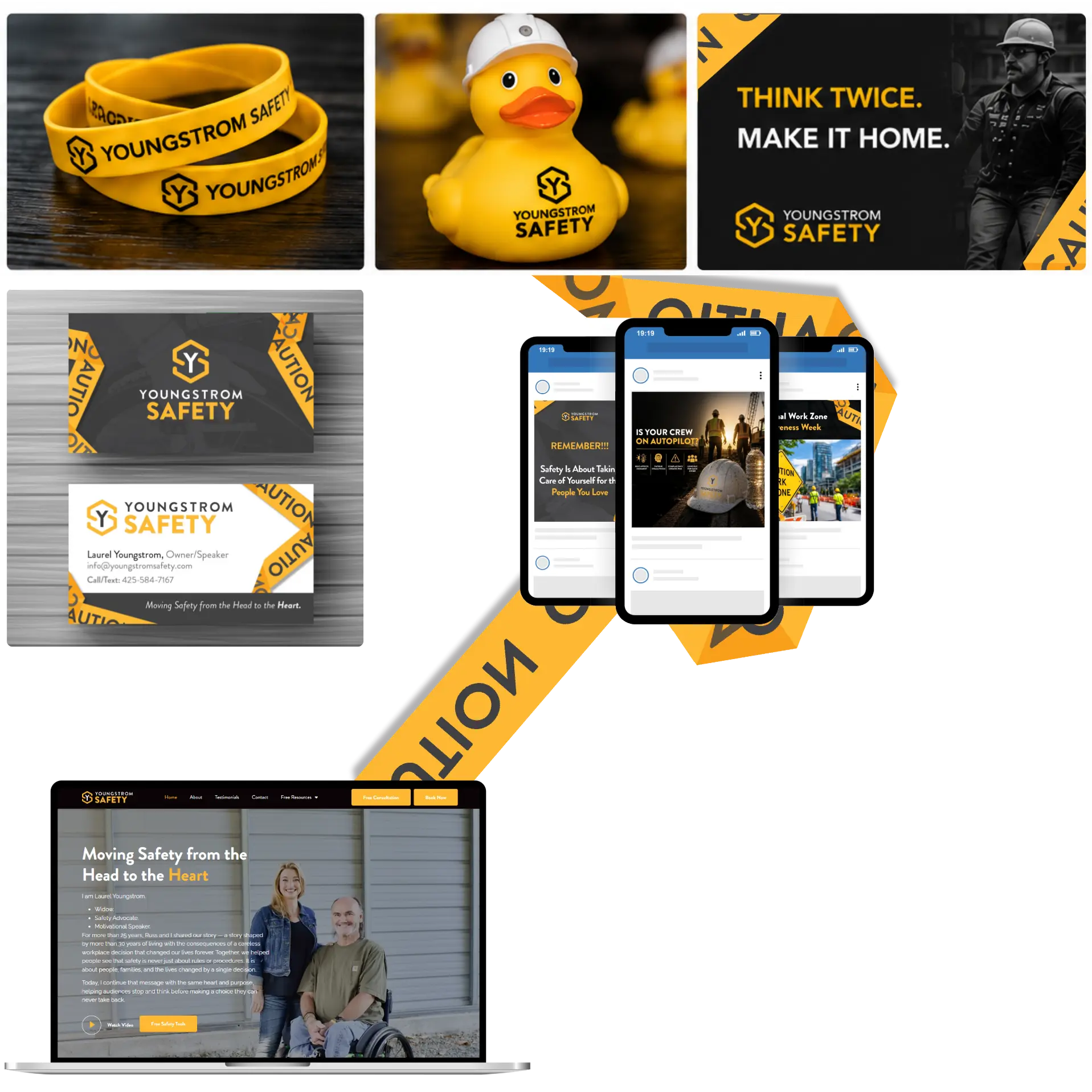
Youngstrom Safety’s website brings its mission of moving safety from the head to the heart into a clear, engaging digital experience. It shares Laurel’s story, highlights testimonials, and makes it easy to explore the impact of Youngstrom Safety’s presentations.
The site also serves as a resource hub, featuring the 12 Free Safety Prompts, consultation and booking options, blogs, podcasts, Safety Events, Info in a Nutshell, and an interactive map of past presentations across North America.
A memorable presentation is only the beginning.
We developed interactive campaigns, giveaways, and digital experiences that encouraged attendees to scan, participate, and stay connected.
By turning engagement into action, Youngstrom Safety continued building relationships long after the presentation ended.
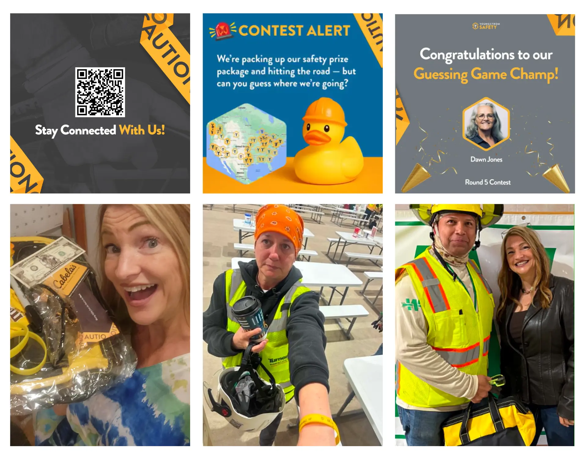
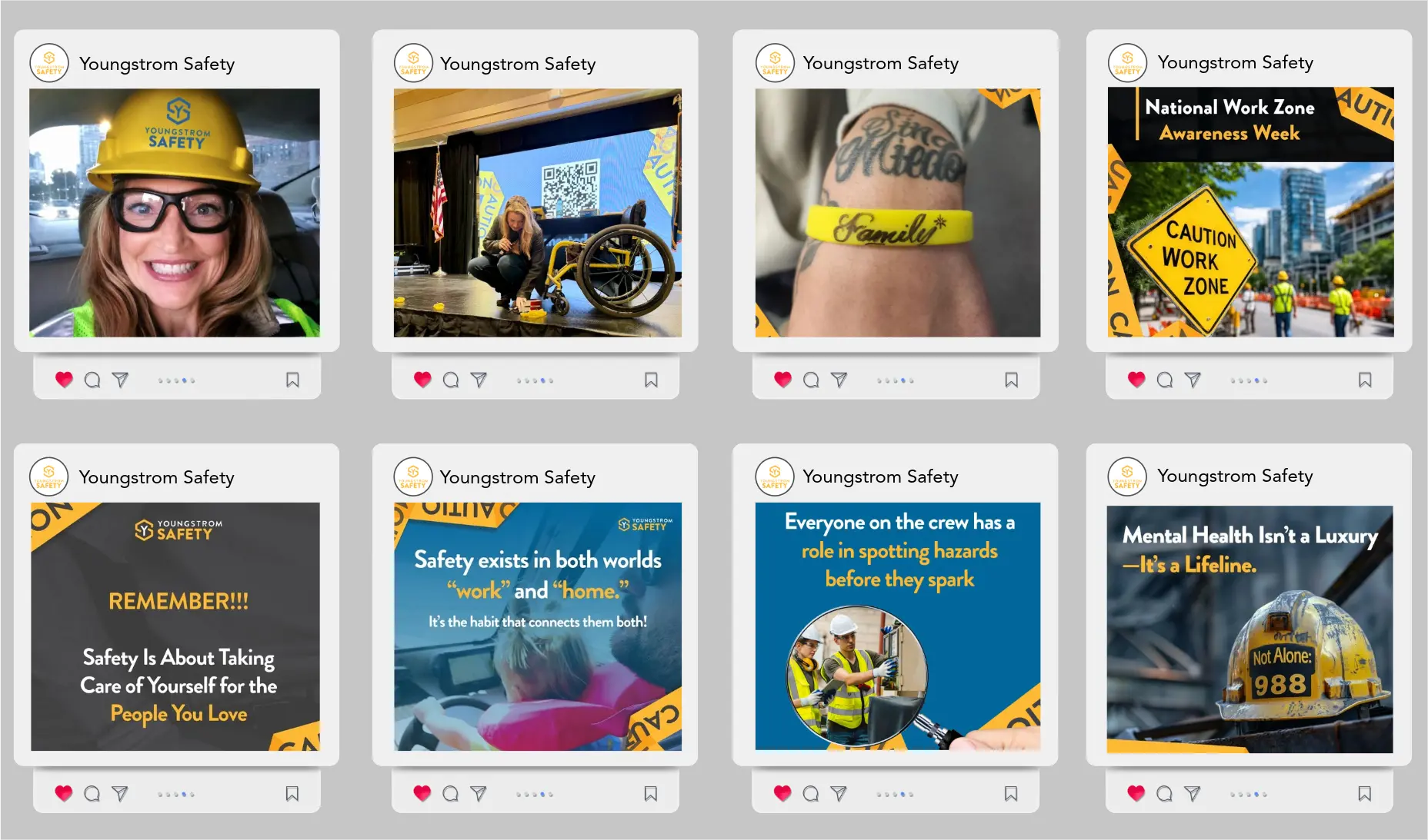
Social media has become a powerful platform for Youngstrom Safety to inspire safer workplaces and build meaningful connections with workers, leaders, and organizations.
We’ve transformed their online presence into a space where safety is personal, memorable, and rooted in the people who matter most.
Through our efforts, we:
Entertained: Used creative storytelling, relatable moments, and engaging visuals to capture attention and make important safety messages memorable without losing their impact.
Educated: Shared practical safety insights, real-life experiences, and thought-provoking discussions that help individuals and organizations build stronger safety habits both on and off the job.
Engaged: Fostered authentic conversations by highlighting personal stories, celebrating safety champions, and encouraging audiences to reflect on why every safe decision matters—for themselves and for the loved ones waiting at home.
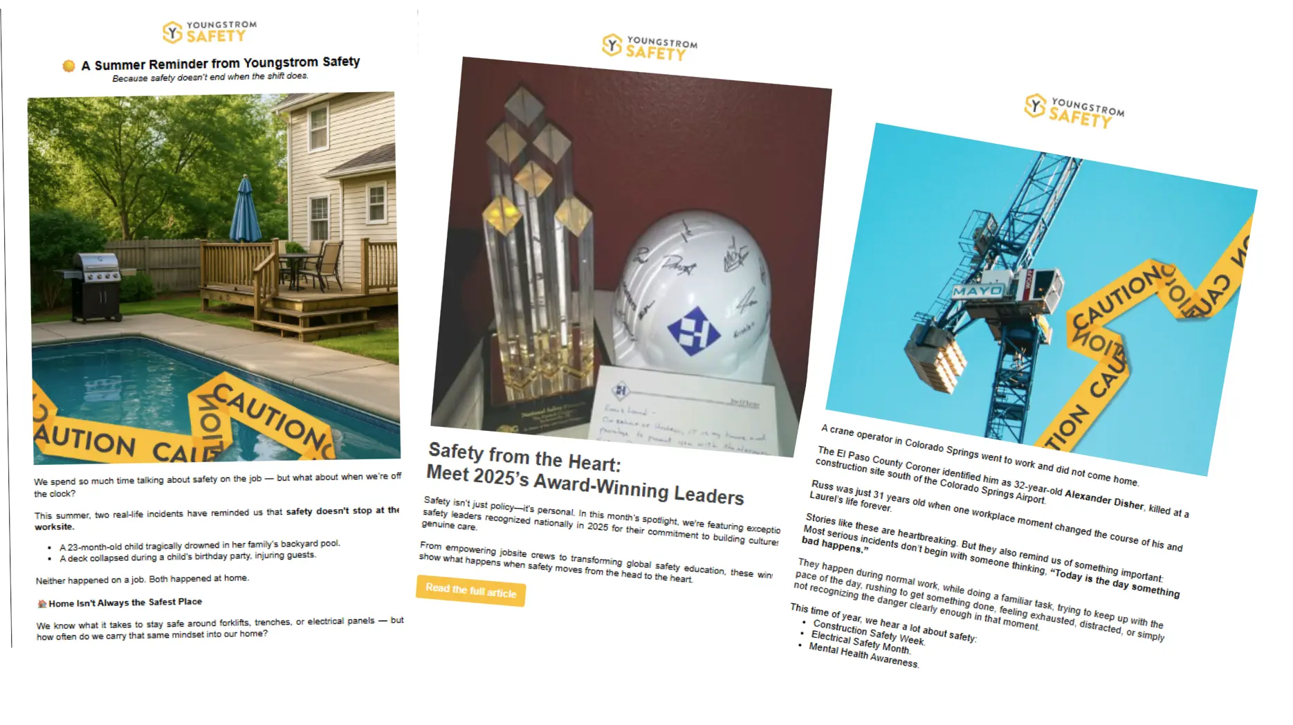
We designed a series of branded monthly newsletters that extended Youngstrom Safety’s mission beyond the stage.
Through compelling stories, practical safety insights, and engaging visuals, each edition kept audiences connected while reinforcing the message of moving safety from the head to the heart.
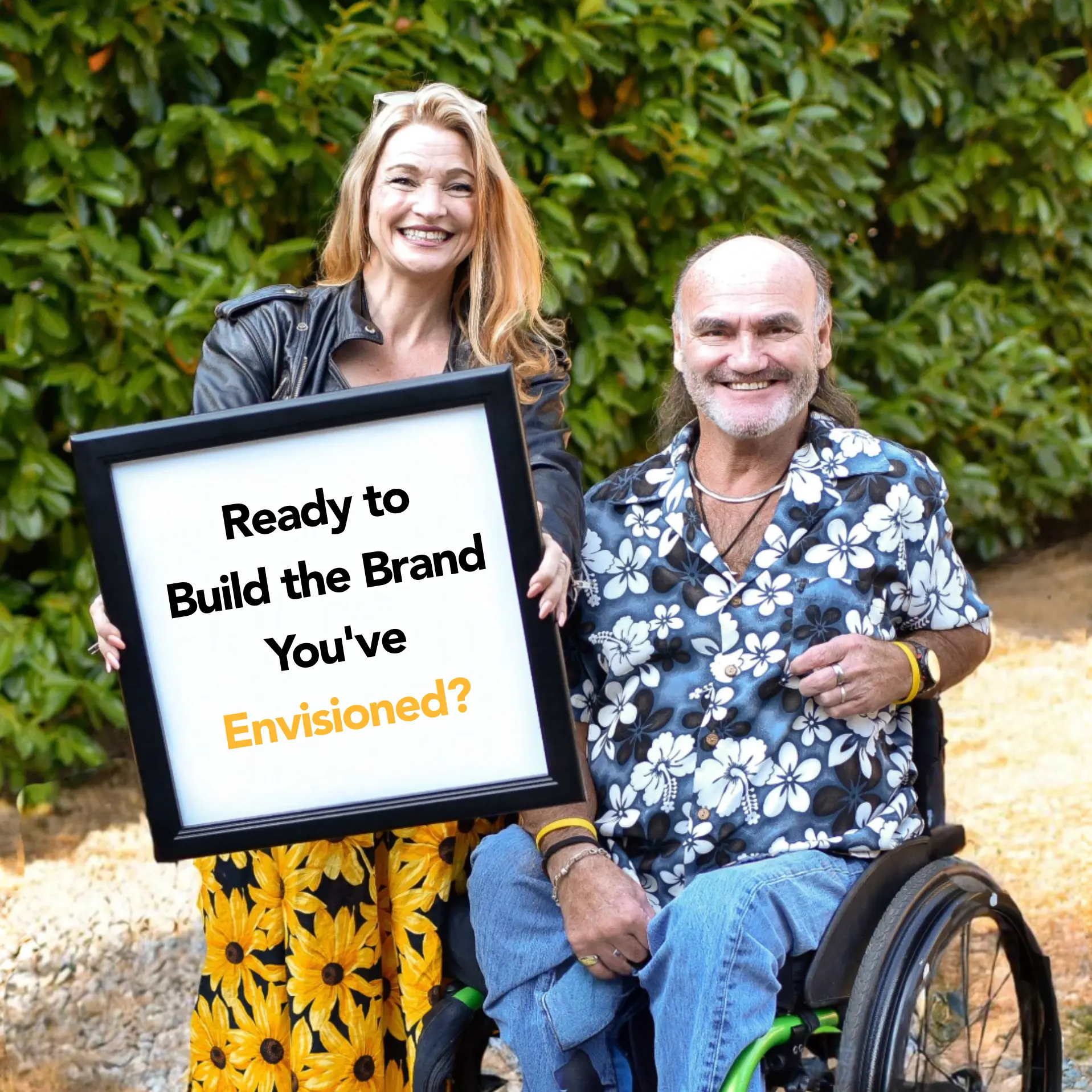
Whether you’re starting from scratch or refreshing an existing brand, we’re here to help bring your vision to life.
Great brands are built with intention.
Discover the strategy, creative process, and design decisions that shaped the Youngstrom Safety brand—from visual identity and messaging to the website, social media, and marketing materials.

Copyright © 2018 – 2026 Viim | All rights reserved.